

Be Bold.
Become Memorable.
Louder than words.

Communicate an idea, a feeling and trust before a single word is ever used. Other brands only use logos to tell people who they are. With abstract shapes like this one, you use brand imagery to elevate your marketing to feel more like an art piece, keeping customers intrigued and making you stand out.
Signature Signage.
Accessibility and legibility are critical. If your marketing is too far away to read, your potential customer has dyslexia, or they are in too much of a rush to read what’s on it, you have missed out on a long-term patron of your goods or services. When you advertise with big, bold abstract shapes, you are far more likely to catch your customer’s eye. Even if they don’t read the sign, they remember what it looks like. They’ll remember how it felt.
A warm welcome.

Always designed to look great as a “Hero Image” for your website homepage, this visual anchor helps users stay engaged, reduces the bounce rate on your page, and boosts potential conversion rates.

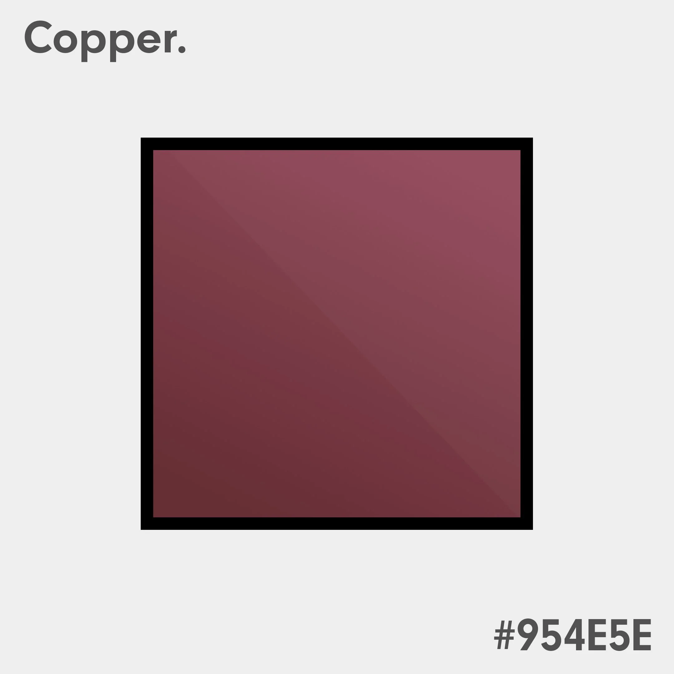
A colour to match every moment.
Your branding should be consistent, but also leave room for flexibility to breathe in multiple contexts. Upon request, you’ll receive different variations and looks to maximise branding value and reusability from your commissioned project.
Shine Bright.

Your colours will be carefully selected beyond just your logo’s colour palette. Your product line's colour palette, font choice, and where you plan to display your adverts will be considered to maximise attention without feeling overwhelming.
Designed with care and precision.


Tell a story in an instant. Upon project completion, you’ll receive documentation explaining the methodology behind branding. Documentation makes it easier to communicate, justify and finalise marketing proposals, making your life as easy as possible while enriching your brand identity.
