A clinical dissection of:
The Onslaught:
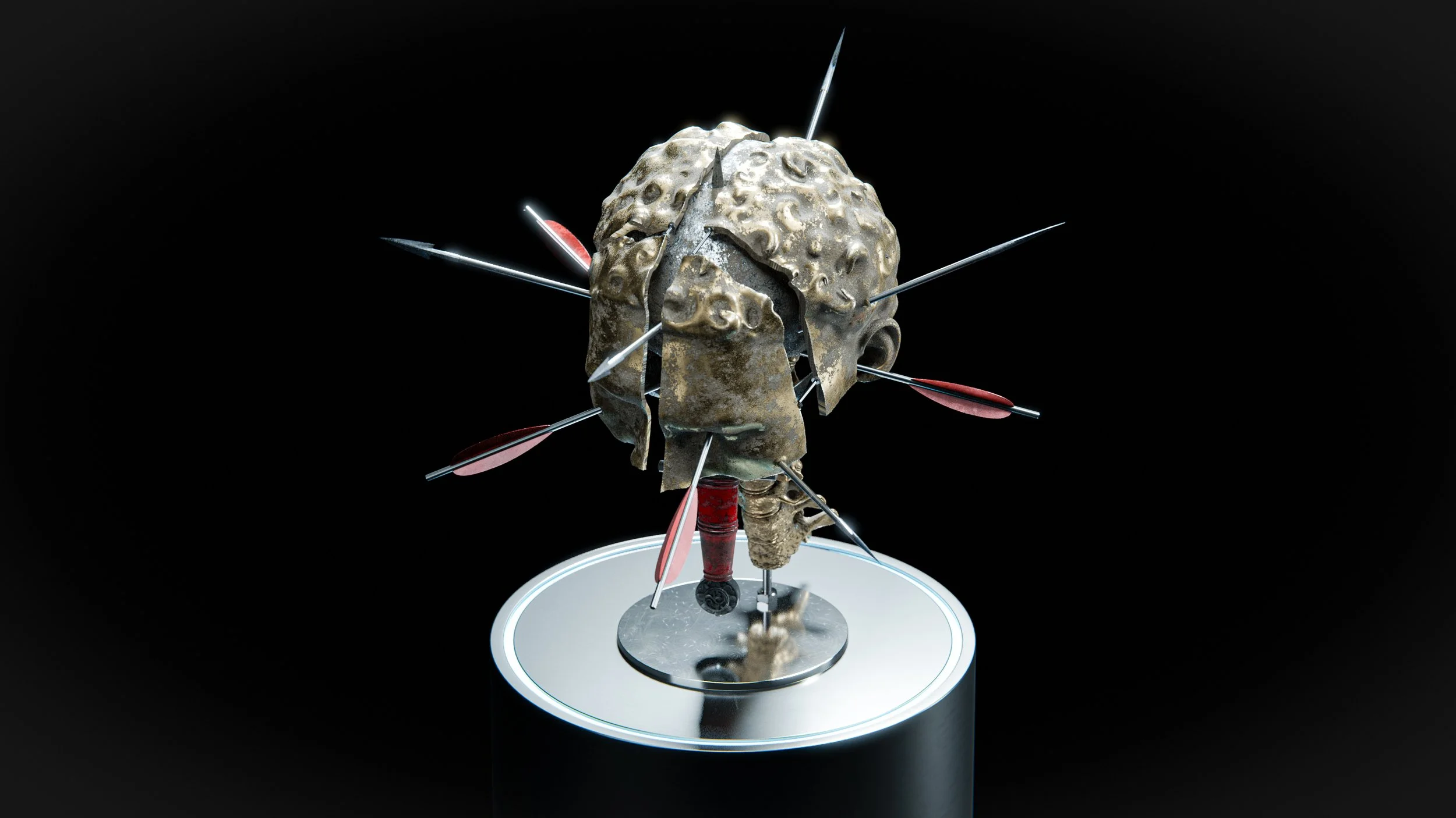
in piercing multitude
Introduction

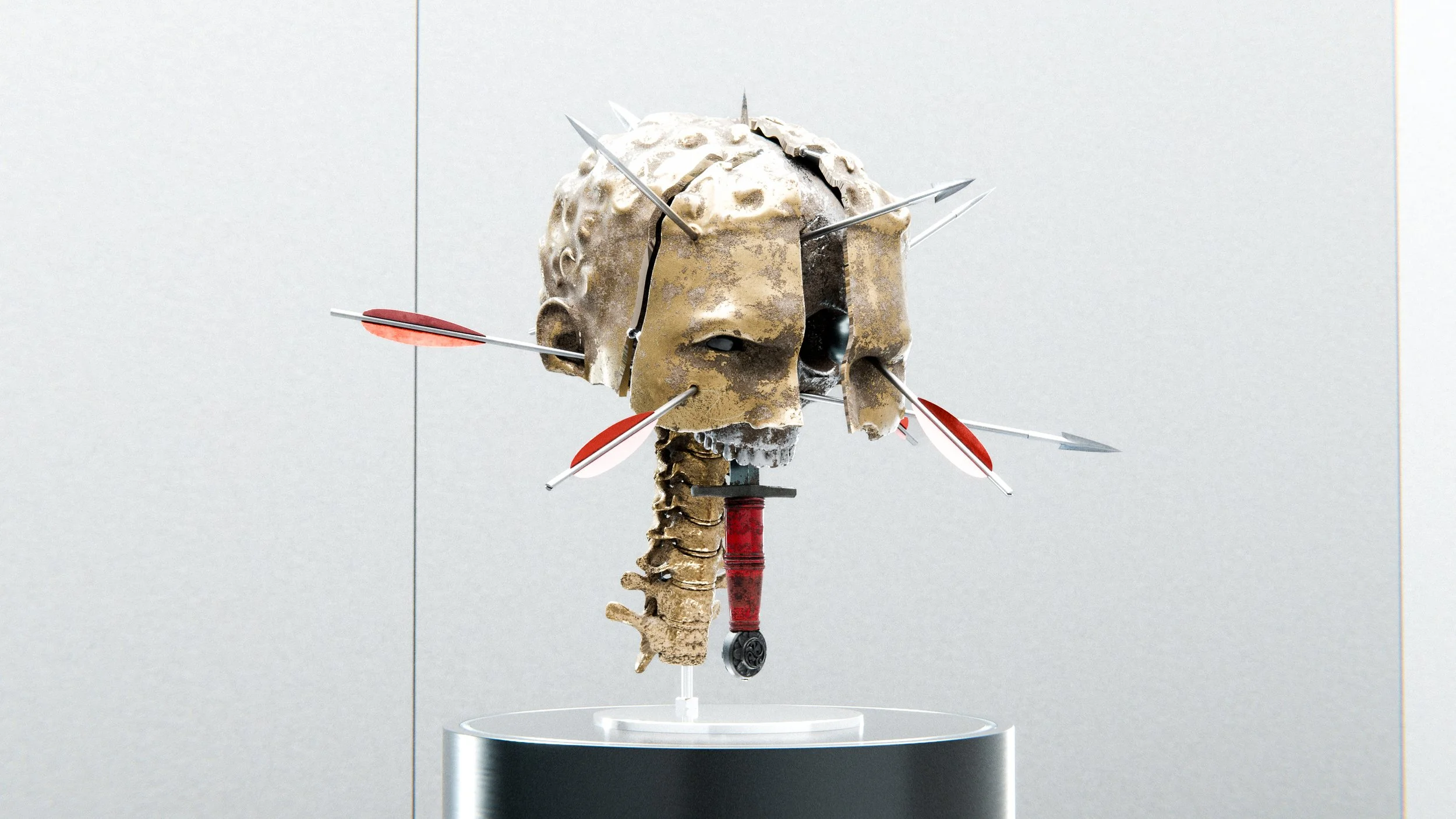
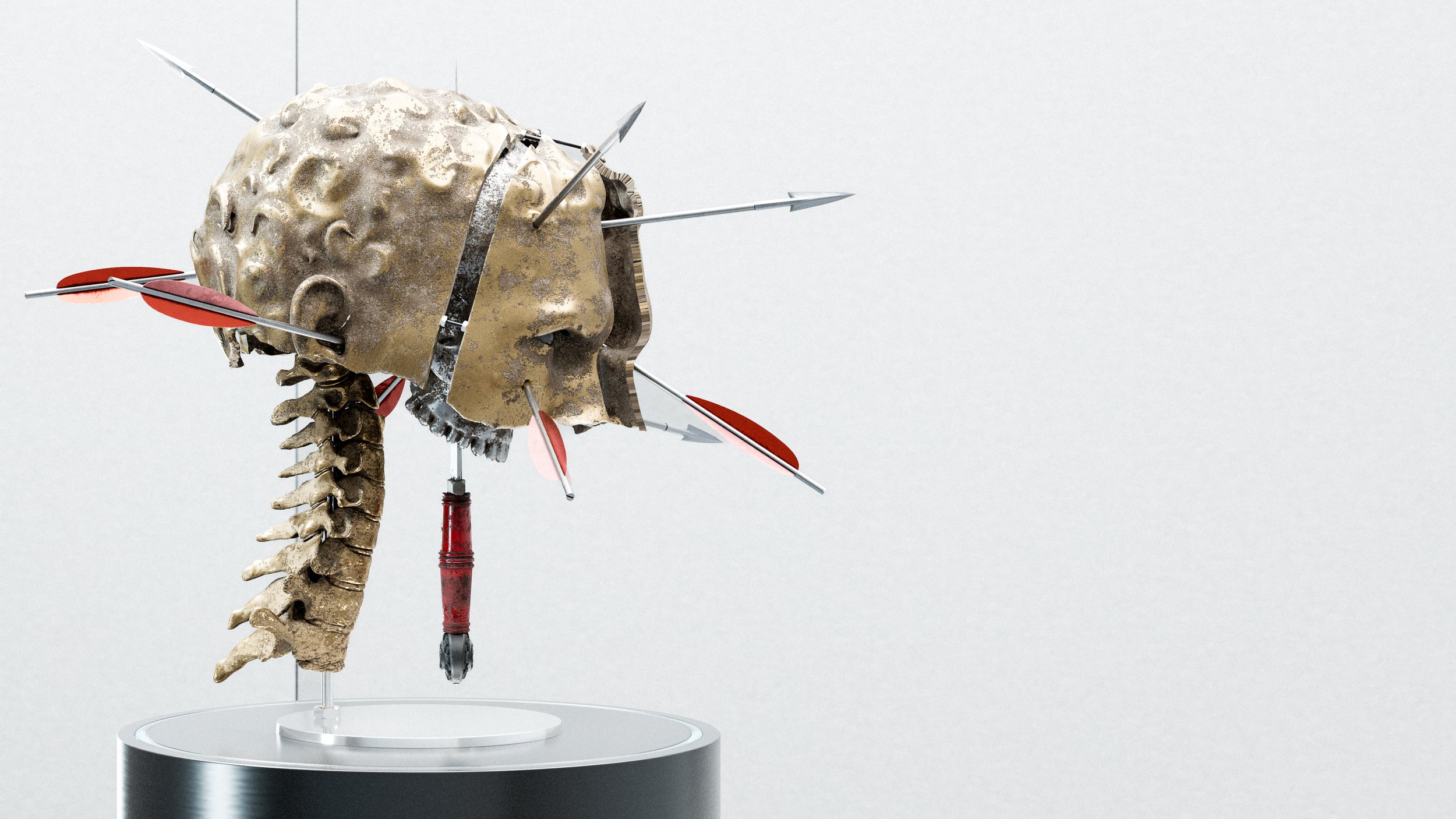
Sex, Money, Dreams, Vices, Doubts & Worries. Each is a single thought to take your mind in a single direction. Altogether, enough to fracture one’s mind. Enough to break one’s peace. Let me show you how my work, “The Onslaught”, came to be.
In my professional life, clients hand me blueprints to help them build their vision. In my personal life, the world hands me a shovel. I must dig to find mine.
In the torrent of a hectic stream of thoughts brought about by a stressful period in my life, I caught a fish.
“When you stand in the centre of the battlefield, rarely is one hit by only a single problem. Be prepared for them to come all at once, from every which direction — in piercing multitude”, proclaimed the fish.
Standing in the stream, watching other fish thrash past me violently, I considered it prudent to keep a tight hold of my current catch. It would be enough to satiate my hunger.

Artistic Direction
The Chariot Race, 1882. By Alexander Von Vagner
Much of my work is inspired by Renaissance-era paintings with my own macabre, surrealist twist. I like to explore themes of symbolism and the divine.
Although I appreciate works concerning the Roman Empire, the themes generally didn’t speak to me on a personal level.
When I saw the oil canvas painting, “The Chariot Race”, I was simply struck with awe by the violence, grandeur and visual intensity skillfully captured in the quiet, contemplative nature of a still painting. This was the atmosphere I sought to encapsulate.

Deciding on a colour palette was almost trivial.
Gold and neutral beige are a key stylistic choice in most of my artwork and an anchoring base colour for the paintings I took as inspiration.
Spashes of Red are carefully used to bring visual “pop” to Roman paintings. It is to be used sparingly as it is a visually striking colour, especially compared to the neutral colours it is surrounded by.
Silver, a contrasting colour, acts as a bridge between the vibrancy of the gold base and the accenting red. In a traditional medium, I would have used white, but in a 3D environment, it is more apt to use a colour that can dance with the dynamic lights.
Symbolistic Intent
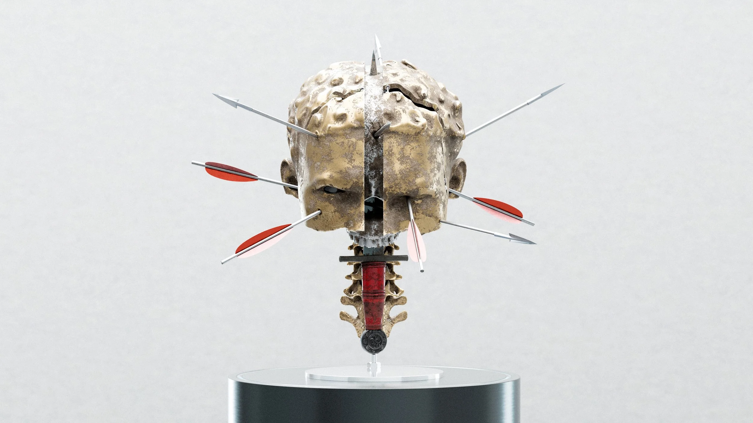
Pain. Distraction. Anger. Sadness. Stoicism. Silence. Contemplation.
Pain & Distraction
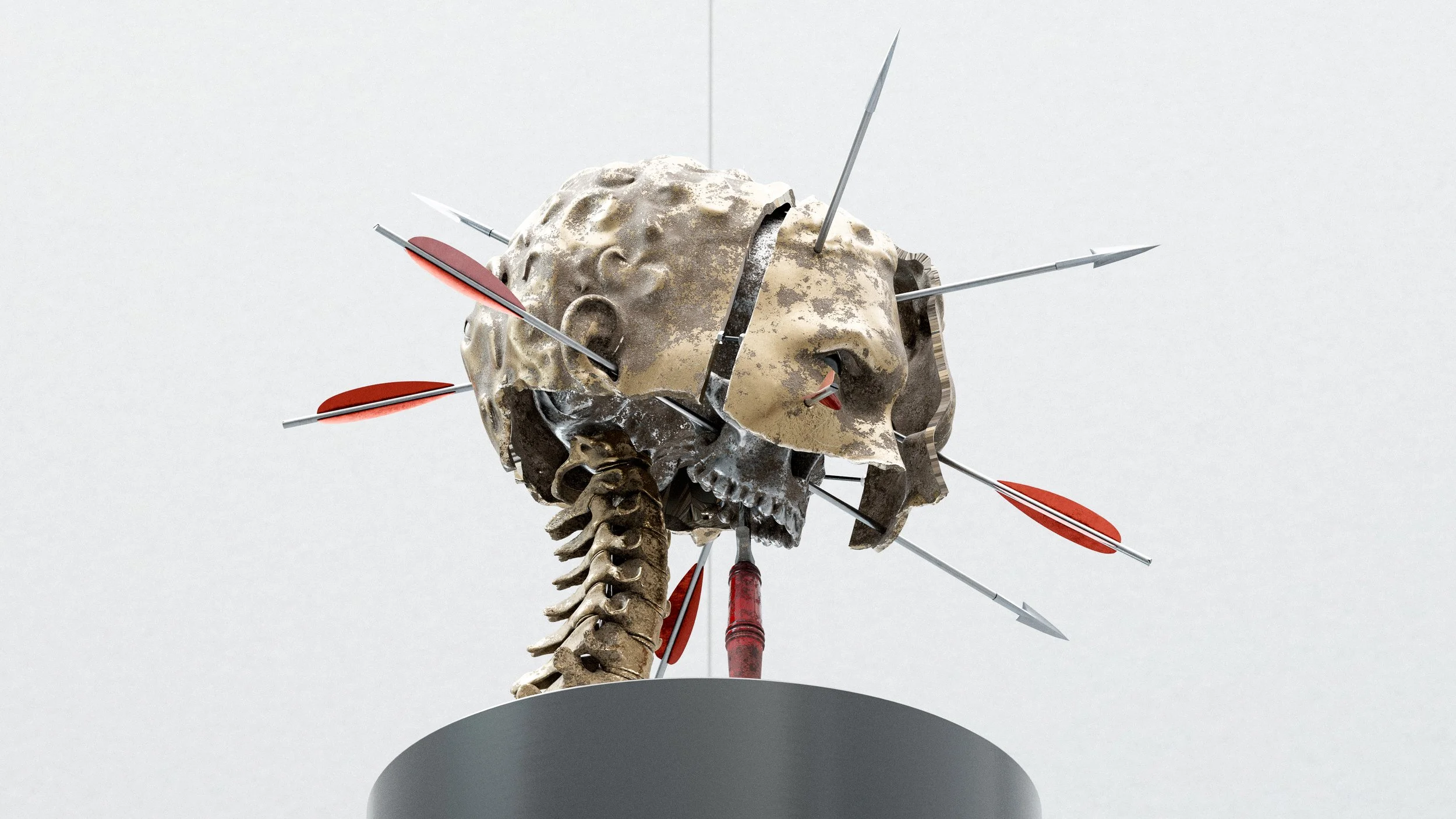
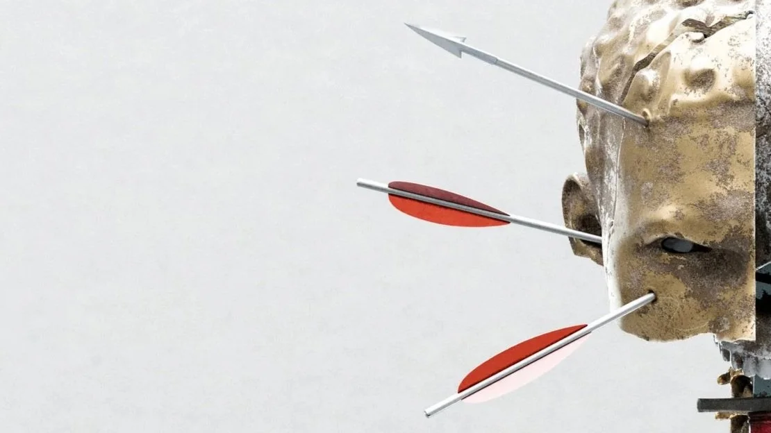
Every arrow: an unpleasant thought, taking a person in different directions.
Anger
The harder you furrow your brow, the less you can see, but the more focused your vision may become.
Sadness

Some thoughts not only inhibit your mind, but they can also take away your vision. Not only do you lose your eyes, you lose the window to your soul.
Stoicism & Silence
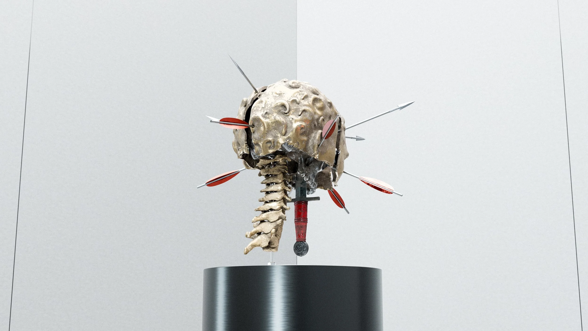
A blade stowed at the jaw. A dagger kept sharpened by the mind. A silver tongue. Not needed but always ready.
Contemplation

Despite all of it, you always find a moment to separate from the visage. To show others and yourself what’s on your mind, beneath the expression.
Camerawork
Focal Length

In all of my work, I carefully consider the focal length of every shot during the process of planning out and blocking the elemental composition. This is because the camera's very nature may alter how a subject or the composition as a whole appears in the final renders.
When the focal length is low, the relational depth and separation between objects become apparent. Too low, and this can become distorted in the wrong context. When it is just right, the subject matter may appear more dynamic and its depth is better perceived.
When the focal length is high, objects further behind will gain a more equal draw of attention. Too high and the subject may lose visual interest. Just right, and the image may feel more dramatic and allow all elements to pop equally.
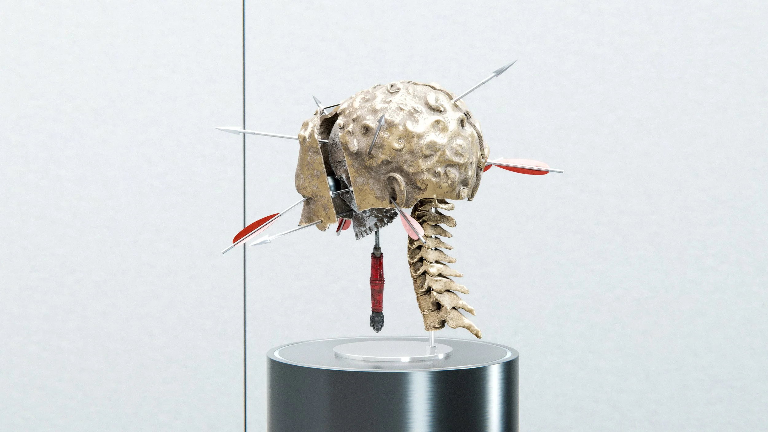
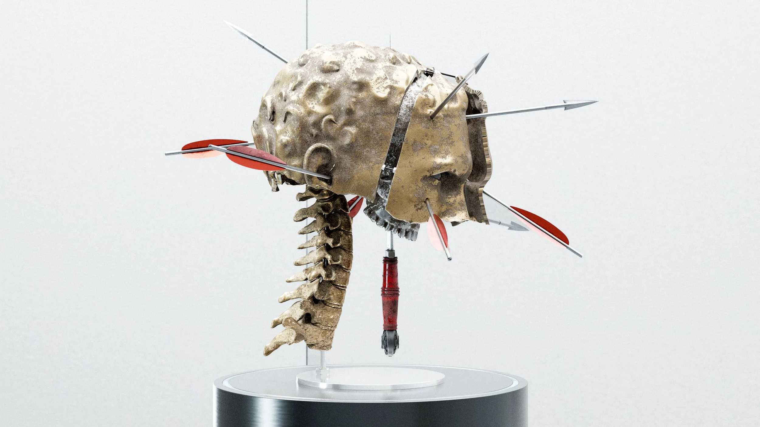
In the 200mm Hero Shot, the arrows needed to share presence and be equally visible so the artwork is immediately “readable” in intent.
65mm was perfect for some shots, demonstrating the angle and direction of the arrows implanted in the subject’s skull.
Once the drama was established at 200mm and the dynamism demonstrated at 65mm, it was simply a matter of intuiting the best feel for the focal lengths in between. I landed on 180mm & 150mm for the accompanying shots.
Lighting

Breaking down the lighting alone would be a very lengthy and dense topic. This lighting array alone took me several hours to carefully select and position the appropriate size lights, to fine-tune the intensity and colour of each light and to ensure they play nicely with both the light and dark backdrops.
To keep things concise: There is one large Key Light, one Hard Light, one ambient light and four Side Lights that double as rim lights depending on the camera angle. There is also a world light, the setup of which you can see in the top left of the above image, which was used for visual separation between the background and the subject.
The intent of all of them working in tandem is to bring colour to the red and the gold, illuminate the silver, which in comparison has less texture, and make the shadows within the crevices pop with contrast without losing too much detail.